What Do You Think?

Post in here if you got some awesome videos or pictures to share!
User avatar
Mandalor
Registered User
Registered User
Posts: 7350
Joined: May 9th, 2013, 6:36 pm
Location: Your imagination
Contact:

Re: What Do You Think?

Post by Mandalor »

Yeah. Maybe a different font for it. Maybe if you made it bigger. I'm not to good into graphic design and Photoshop but those are my thoughts too. The font seems okay now that I think about it. Just increase the size possibly. If you'd want tot there might be a more bolder font out there :P Nice job as always Voltage :awesome:
-Mandalor
97 Aimbot Catches | 35 ESP Catches

Image

Steam: The Deer Hunter | Evolve: theniteowl | Raptr: theniteowl | Origin: 90sguy
Image
Image
ImageImage
Resigned - 29 September, 2015
Colonel - 7 March, 2015
Saint of the Month - 3 March, 2015
Major - 10 January, 2015
Captain - 9 June, 2014
Lieutenant - 22 November, 2013
Saint of the Month - 18 July, 2013
Sergeant -12 July, 2013
Corporal - 8 June, 2013
Private - 9 May, 2013
Applicant - 9 May, 2013
Image
Image
User avatar
VØLTÅG£
Registered User
Registered User
Posts: 720
Joined: June 28th, 2013, 5:29 pm
Contact:

Re: What Do You Think?

Post by VØLTÅG£ »

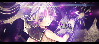
Text isn't my forte, nor has it ever been; and I can pretty much guarantee I won't be able to invest the time I need to better myself at it. I just use a pretty broad/acceptable font for most sigs and use the eyedropper tool to select colors from the sig that aren't to bright but are noticeable at the same time. I think the lighting is fine. I didn't want it on any of the corners because that is where my slow black fades are. With the render placement, the only practical place I saw to put a good source of lighting was behind the spartan then from there make the colors gradually darker and fade into black near the edges. But everyone is entitled to their own opinions. It is art.
Image
ImageImage
ImageImage
User avatar
VØLTÅG£
Registered User
Registered User
Posts: 720
Joined: June 28th, 2013, 5:29 pm
Contact:

Re: What Do You Think?

Post by VØLTÅG£ »

A§H»Mandalor wrote:Yeah. Maybe a different font for it. Maybe if you made it bigger. I'm not to good into graphic design and Photoshop but those are my thoughts too. The font seems okay now that I think about it. Just increase the size possibly. If you'd want tot there might be a more bolder font out there :P Nice job as always Voltage :awesome:
-Mandalor
I don't want the font too big, bold, or vibrant because it can distract from the main focus of the piece; the spartan.
Image
ImageImage
ImageImage
«DG»Suika
Registered User
Registered User
Posts: 62
Joined: May 8th, 2013, 11:34 pm
Contact:

Re: What Do You Think?

Post by «DG»Suika »

One tip far as text goes is the rule of thirds. It applies to more than just signatures, but it does look nice.

Image

Where those circles are, are usually where the text should go so long as the render is centered and focused.
Image
Get busy living.
User avatar
A§H»Chaos™
Posts: 76
Joined: January 30th, 2013, 5:46 pm
Contact:

Re: What Do You Think?

Post by A§H»Chaos™ »

thought the rule of thirds only applied to photography but hey you learn something new every day
Did I ever tell you the definition of insanity? - Vaas Montengro (Far Cry 3)
Insanity is doing the exact... same f###ing thing... over and over again, expecting... s### to change. That is crazy. but the first time somebody told me that...I dunno, I thought they were bulls##ting me, so boom , I shot him. The thing is, okay... He was right. And then I started seeing: everywhere I looked, everywhere I looked, all these f###ing pricks, everywhere I looked, doing the exact same f###ing thing... over and over and over and over again thinking: "This time, it's gonna be different; no, no, no, no, no, please.. This time it's gonna be different."
Post Reply